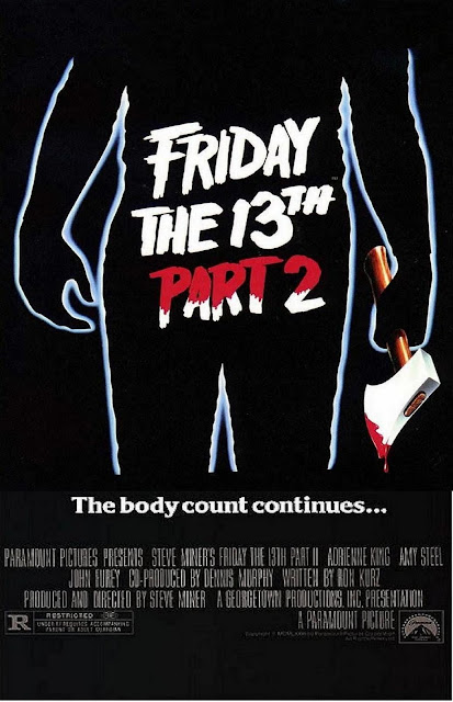
This poster is very basic and simple, but you get told so much about the film and the genre. The poster shows the outline of a person, creating a silhouette. The person is holding an axe which has blood dripping odd the blade. This tells the audience a lot about what the film will entail and showing the blood an gore that will be in the film.
On the body is written the title of the film in a bold, contrasting font. The title is written in full capital letters, making it stand out to the audience. On top of that, the font is white on a black background, making it very eye catching. The writing takes up half of the poster making it very obvious to the audience. The words "PART 2" are red as if covered in blood, suggesting the film will be full of blood and gore moments. Under the silhouette is written "The body count continues..." suggesting that lots of people will die in this film, and that the number of deaths will rise from the first film.
Along the bottom of the poster are all the small details such as actors, directors and film companies such as paramount. On the bottom left there is also the age rating so that the audience know the rating.
Wednesday, 24 August 2016
Wednesday, 17 August 2016
The Simpsons - Editing
This clip from 'The Simpsons' shows an editing error. Although a minor editing issue, it showed a lack of quality and time going into the episode. The scene shows Frank Grimes Jr. wearing a cape, running away on stilts from Homer and Sideshow Bob. In the chase, Frank's cape fall off as he runs, but when the camera cuts away and then back to Frank, the cape is magically back on and around his neck. We only see it on for a few more seconds before the next scene has Frank walking around a corner without the cape. This editing issue is a very minor mistake, and in my opinion, makes it quite a comical scene due to it being such a simple and silly error.
I believe that the production team of The Simpsons placed the two scenes in the wrong order. If they swapped the scene where the cap falls off with the scene with it on, it would have no issue where the cape teleports back on. The scene would show Frank wearing the cape on the stilts, cutting to Homer and Sideshow Bob, and then it would cut back to Frank and the cape can fall off, so that the clip of him walking around the corner, his cape wouldn't be on.
This editing error shows how easy it is to make these mistakes and so when we edit our work, we will try our best to make sure that our editing makes sense without any continuity errors.
Friday, 12 August 2016
Into The Wild Book Cover's
Although 'Into The Wild' is a book, the front cover is very similar in many ways to a film poster. They both present the title to the audience, trying to attract them to watch the film/read the book. These front covers need to be appealing to those going past because if not, potential customers will ignore the book as the front cover should represent the book and what it is about.
'Into The Wild' uses bold, eye-catching fonts to stand out to the target audience to try and sell as many as possible. Both of the front covers for the book have the font covering half of the book, making it legible and obvious to the audience.
Both of these posters have a long distant picture, suggesting the setting of the book. The image interests the reader into picking up the book and hopefully purchasing it. The images used can convey the book to the audience and hopefully grab their attention. Just like a movie poster, the book suggests what it will be like.
Wednesday, 10 August 2016
Kingsman: Secret Service - Sound
This scene from 'Kingsman: Secret Service' shows a really good use of contrapuntal music. The clip shows the protagonist (Eggsy) in a fight, in a position where he is about to die/be arrested. He contacts Merlin who then makes all the chips that were placed in people's heads blow up, meaning Eggsy can stop Valentine from making everyone in the entire world fight.
The scene in which everyone's head is being blown off their shoulders, shows a great example of contrapuntal music. The non-digetic soundtrack playing in the background juxtaposes the scene of heads exploding into fireworks. The happy music combined with the fireworks exploding into red, white and blue makes the scene seem good to the audience. This is what the producers would've wanted as they would want us to side with the good guys, and celebrate that they have almost won against Valentine, stopping him from making everyone in the world battle to the death.
This church fight scene also has an excellent choice of music. It plays 'Free bird' by Lynyrd Skynyrd which is a very action packed song, making the fight scene seem thrilling and exciting to the audience. The start of the song is smoothly edited into the scene with the gun shot. This fight scene is particularly entertaining to the audience, not only for the fighting itself, but he music is a great addition to it. The dramatic music makes the audience feel involved and really put themselves in the shoes of Harry during the fight. Even though Harry is killing every single person in the church, the audience still see him as the good guy due to his actions and how the music agrees with his actions.
Subscribe to:
Posts (Atom)