How effective is the combination of your main product and ancillary texts?
All the work we've completed has looked at the
conventions within the media industry. The posters and magazines in
particular were solely focused on the standard conventions of horror film
posters and magazines and how they were created, represented and portrayed to
the audience.

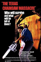
 For our poster, we looked at many well-known movies to
create our poster on. We looked at the different magazines for Texas Chainsaw
Massacre to show how they have changed over time. We compared the 1974 film
poster to the modern day posters for the film franchise. This helped us to
judge what the modern features and conventions of magazines are and what we
should include to make sure it looks sleek and up-to-date with modern times. We
also studied Friday the 13th’s poster so we could compare another
large film franchise and their styles of posters. By comparing the two sets of
posters, we saw the common themes. For example, dark colours as background,
lots of red as the blood, not too much text (but any text to be white or red)
and a large main central image to grab the attention of the audience.
 Right at the beginning of our work, we instantly
looked at two movie posters to create initial ideas of how ours would look. We
analysed ‘The Thing’ and ‘The Amityville Horror’ film posters, which were
slightly different from common conventions. They both used the same text colours
of either red or white, whilst not having too much text. However, ‘The Thing’
used the masthead to show the main central image in the font. This was
interesting, but it wasn’t very typical of the industry and so we didn’t use
many of its features. ‘The Amityville Horror’ poster also went against the
common themes by using some different colours. The lighting on the building in
the background makes it stand out, but the green tint isn’t common for horror
posters. On top of this, the masthead was quite a thin font, which was
different to the other posters we have looked at because it doesn’t stand out
as much and so doesn’t attract the audience as much as a larger font. We used
these posters to create our own poster right at the start, where we tried to use
the common conventions from these posters.
By the time we were creating our final posters, our
idea of the conventions had been fine-tuned and so our posters could be more
conventional to the industry. A conventional poster is beneficial to smaller
media companies as it helps the audience associate the poster with the
industry. A bizarre, unconventional poster may be more difficult for the
audience to know the genre just from looking at the poster, and so may not help
the film get viewed.
 For our magazines, we studied ‘SCREAM’ in great detail,
as we wanted to look at a magazine that works with our genre. Scream class
themselves as the number 1 horror magazine and so we wanted to use the
conventions they had to create our own horror magazine. ‘SCREAM’ used a large
main central image with puffs neatly down one side with a standout border. We
wanted to create similar effects for our own magazine front cover, and so we
created a sleek front cover with text down the right hand side, neatly boarded
off from the main central image. We had the title along the top with the
pricing and the website, and the barcode in the bottom corner.
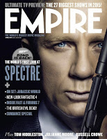
 We also looked at some other magazine front covers
such as Empire and Match Of The Day. We used our analysis of Match Of The Day
to look at how they displayed puffs to advertise the rest of the magazine. They
placed puffs randomly around the front cover in different shapes to fill the
empty spaces. They made sure the front cover was full of colour and was very
eye-catching. However this didn’t particularly help with our magazine front
cover due to the largely different target audiences (kids vs adults) and genres
(sport vs horror). Empire magazine was more relevant to use. They used a large
central image that spans the whole page and goes behind the text, with headings
down the side to display the content of the magazine. We used the ideas of
Empire to help with the layout of our magazine to make sure it looks sleek and
professional.
We also looked at some other magazine front covers
such as Empire and Match Of The Day. We used our analysis of Match Of The Day
to look at how they displayed puffs to advertise the rest of the magazine. They
placed puffs randomly around the front cover in different shapes to fill the
empty spaces. They made sure the front cover was full of colour and was very
eye-catching. However this didn’t particularly help with our magazine front
cover due to the largely different target audiences (kids vs adults) and genres
(sport vs horror). Empire magazine was more relevant to use. They used a large
central image that spans the whole page and goes behind the text, with headings
down the side to display the content of the magazine. We used the ideas of
Empire to help with the layout of our magazine to make sure it looks sleek and
professional.For our film, we looked at a few short films, some stop-start animations, YouTube videos, film segments and many film trailers. Each of these helped our production in different ways, so we could collect the common conventions and then create our work with these conventions in mind.
The trailers were useful as it focuses on the editing
in great detail, helping us because a short film needs to be like a long
trailer so it can keep the audiences attention. We also looked at a few YouTube
videos to look at editing techniques so we could utilise FinalCutPro better. By
looking at the editing in detail, we were able to improve our work and make it
far more professional.
We looked at stop-start animations so we could get some ideas as to how we would incorporate elements into our film smoothly. Once we decided on the conventions of the stop-start animations, we studied the key ideas as to how to film it. Then we were able to begin our plan of what to film, where to have the camera and golliwog, and how to keep the golliwog in position whilst filming.
We used segments from other films such as 'Kingsman' to
focus on music. We needed to ensure we had correct music to the scene, but also
considered the use of contrapuntal music in our production. We know that music
plays a big role in a film to engage the audience and create a specific
mind-set for the audience. The soundtracks need to be engaging to make the film
more gripping for the audience. The conventions of music were that the edits
were timed with the beats, and the music is load but fades at the end.
Overall, our film, poster and magazines interlink
nicely to create a strong, initial brand image for ‘Oblivion Productions’
because we used the same colour schemes and similar styles throughout all our
work. On top of that, our work should appeal to lots of favourites of horror
films as our work looks professional and so appeal strongly to the audience.
The posters and magazines hopefully will attract the audiences to watch our
film and boost the overall views of our production.
No comments:
Post a Comment