Wednesday, 30 November 2016

Survey Results

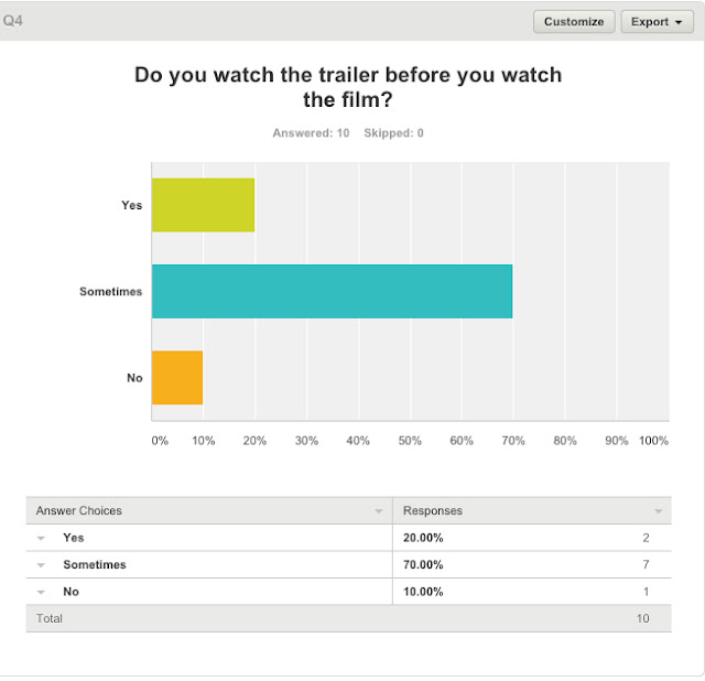
These are the results from our survey. 10 people answered our survey, and on some questions we have got more than 10 answers as we allowed them to select multiple answers.


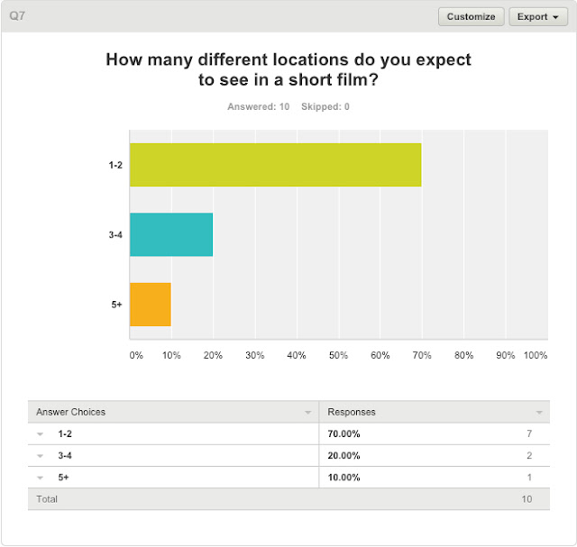
The results in question 4 tells us that many people are not fussed if they watch a trailer before the film, as 70% of people that took our survey responded sometimes. This means that we could make a trailer for our short film, although it would be difficult to show off the film, but not show too much.


The results to question 5 tells us that half the people surveyed would prefer 1-2 characters, likely to be because multiple characters can get confusing for the audience in a short film, as there is not much time for the audience to learn about and connect with the characters.


The results to question 6 tells us that 80% of people who took our survey would want a short film to be between 4-6 minutes. Not too short that you can't get into the film, but not extended in length for little reasoning.


Wednesday, 23 November 2016

Creating a Survey

We created a survey so that we could analyse the target audience. We used a variety of questions, looking at who is taking the survey (age and gender) and then asked about their favourite genres. We then asked the age rating they think this should be. We then changed the topic to short films, asking how many characters they expect to see, how old they should as well as how long they short films should be to get their opinions on short films. We then changed the topic to location, asking what locations they would prefer to see in a horror film and how many different locations there should be in a horror. Our final question gages how often those taking the quiz watches horror films on a scale of 1-100.

This is the link to our survey: https://www.surveymonkey.co.uk/r/DX7JKPY

Monday, 21 November 2016

Power of Editing


This is a video published by one of the most successful content creators on YouTube, NigaHiga, who is very well known for his fantastic editing ability. This is a short segment of his video "How to be  Ninja 2.0".

This video is very basic, but really showcases what editing can do. The video shows Ryan (NigaHiga) moving around the kitchen. He keeps the camera in the same place for the whole of it, which is very important for the edits to look smooth. In one shot he walks to the right of the screen and goes off camera. Ryan would then walk around to the left of the screen and walk in. When editing, he cuts it so that when he leaves the screen on the right, he enters it on the left. Another good shot was where Ryan ducked behind the island in the middle of the kitchen and then fell from the top of the screen. This again, with a simple cut, shows Ryan disappearing behind the island and then instantly coming back. They key to these shots are fluid movements. For example, NigaHiga was moving down behind the island and then fell down from the ceiling, making the video look smoother to the audience. Editing has allowed him to create a video where he 'teleports' across the screen.

At the end of the video, NigaHiga overlapped multiple videos, which is where the same camera position becomes key. He filmed himself screaming from multiple different positions in the kitchen and then edited them together so all 10 of him were screaming at the same time. Editing allows him to be in multiple places at once which of course is not possible.

This video is very simple, and yet looks very professional. Nigahiga showcases very basic and easy editing, but makes it look very good. This editing is something that anyone could replicate with quite a bit of ease if they know what they're doing. We are using this video as a guide incase we need to film some shots using the golliwog in a similar way.


Monday, 14 November 2016

Poster analysis (Advancement Through Time) - Texas Chainsaw Massacre

The Texas Chainsaw Massacre is a very successful horror film series, producing lots of high quality, scary films. For each film, there have been separate and unique posters relating to the film which increased the amount of advertising and marketing each film got. On top of this, each film had multiple posters which further improved the branding of the films.
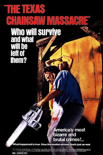
This poster on the left is for the first film which came out in the cinemas in 1974. The poster showcases the age of the film to the audience due to the colours used and how the poster is laid out. The colours are quite bland and almost cartoony. The layout of the poster is very simplistic and lacks creativeness. The poster shows a man holding a chainsaw with a woman tied up behind her. This suggests to the audience what the film will be like. Along the top in bright red letters is the films title, with a bright white question below which contrasts to the black background. The question makes the audience think and should make them want to find out the answers to the questions, which would only be possible by watching the film.
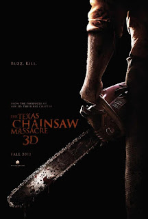


This modern day poster looks a lot cleaner, and is clear it is modern due to the colours, the general layout and also how the image is positioned. This poster is very dark which depicts the genre of the film. It suggests the film will be mysterious, leaving the audience in the dark. The title is a small font so is not very eye catching, however the film has enough branding by the 7th film that the chainsaw is very iconic and most people will link a horror film poster and a chainsaw to 'Texas Chainsaw Massacre' so the title is used to only confirm it. The title is still in red which is used to connotes blood and gore. The image of the person is zoomed in, showing his elbow to his knee. This leaves the audience clueless to who the man is, creating suspense. The man is holding a chainsaw, dripping in blood which is very well edited, making the poster look very professional and modern.
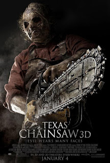


This poster is for the same film as the last poster, Texas Chainsaw Massacre 3D. This poster goes into more detail about the film along the bottom and again has the title in a small font. The character on the front is in dark clothes with a big mask on, holding a chainsaw. The chainsaw is angled in a way that makes it look like it is coming forwards, towards and through the screen as if in 3D. The poster is very dark and has the characters zoomed in, coving the entire poster.


The difference between the two posters is quite substantial, showing how technology and ability has advanced in 40 years. Its very remarkable to see how different they are, and it's clear which poster came first due to its quality. This really shows off the different connotations in film posters and how they are produced, e.g. not much text, dark colours, image covering the entire poster and not a full body image.
Friday, 11 November 2016

Script

Key: 
Brother 1 - Younger Brother
Brother 2 - Older Brother


(Brother 1 walks into bedroom and sees golliwog)
Brother 1: For god sake.

(Brother 2 watching Match of the day)
(Brother 1 walks into the living room)
Brother 1: CAN YOU STOP MOVING THAT GOLLIWOG!
Brother 2: What are you saying?
Brother 1: Can you just stop with moving the Golliwog already?
Brother 2: Seriously what are you talking?
Brother 1: Oh come on you know what you're doing just stop it!
Brother 2: Ok seriously what are you talking about? I just wanna watch Match of the Day, Chelsea's on right now, there's some big highlights.
Brother 1: I don't care about the Chelsea game just stop it!


(Brother 1 and 2 leaving the house to play football)
Brother 1: And then he was just like
(Brother 1 dabs)
(Brother 2 laughs)

(Brother 1 and Brother 2 return from playing football)
Brother 1: Hang on, if you didn't move it then who did...?
(Pause)
Brother 2: I don't know if you didn't move it, hows it there?
Brother 1: This doesn't make any sense.
Brother 2: Alright this is freaking me out.
(Pause)
Brother 2: We gotta do something about this. Take it.
(The two brothers walk over to the bin)
Brother 1: Screw this I'm binning it.
(Throws the golliwog into the bin)
Brother 1: It's not gonna bother us again.


(Next day, the two brothers sit down to watch TV)
Brother 2: I thought you binned that stupid doll...?
Brother 1: I did, I did it yesterday.
Brother 2: Why's it here?
Brother 1: Did you take it out?
Brother 2: Of course I didn't take it out, I hate that doll.
Brother 1: What the hell then?!
(Brother 2 stand up and grabs the doll)
Brother 2: Alright lets get rid of it, lets get it outta here.
Brother 2: This time its not coming back!
Brother 1: Lets put it in the outside bin!
Brother 2: Good idea!
(Two brother leave the room with golliwog in his hand)

(Walking around the side of the house to the bins outside)
Brother 2: Finally this things gone
(Brother 2 puts golliwog in bin and slams the bin lid shut)
Brother 1: If I see that again I'm gonna flip!

Thursday, 10 November 2016

New Narrative

We have decided to amend our narrative as we felt the previous narrative was not going to work as well in a short film. We felt there were too many little parts needed in order for it to make sense to the audience, and would've needed more than five minutes to include the story, as well as the conventions of horror films. This is our new narrative.


After sometime the younger brother notices that one of their kids toys, a Golliwog, starts to appear in random areas around the house. The younger brother thinks it's his brother playing a little joke on him, so he confronts him. The older brother denies even knowing what a golliwog is and continues to watch TV. The youngest brother refuses to accept this but moves on with his day. 

A day or so later, the two brothers leave the house to play football. As they get in the car, the golliwog is watching them from the upstairs window. Whilst they are not home, the golliwog moves into a new place so when the brothers see it, they realise neither of them had been home to have moved it.


The brothers notice that the golliwog is moving much more frequently, and the two brothers begin to get scared and worried. They decide to throw the golliwog away but as they put it in the bin, the golliwog begins to laugh. the brothers understandably get creeped out, but as its in the bin they aren't too worried.


The next day, the golliwog is back in the living room, just sat on the sofa. The two brothers are once again concerned so they decide to throw it out in the big green bin outside. As the brothers go back inside, they lid of the bin opens and the golliwog laughs once again.


Monday, 7 November 2016

Initial Casting

In our short film, we have two brothers. We need to cast two males that are of similar age and ethnicity so that it is plausible they could be brothers. One of our character is younger than the other in our short film, so the two people we cast need to look like they are of slight different age between them. We will do this by first contacting the potential actors over the phone. We will call each of them, giving them a brief overview of the plot. We then began to organise an interview with those that were keen in the role so we could narrow the group down to the two that will play the brothers in our short film.

At the moment we have organised interviews with Peter, Harry, Ryan, Matt and James. We are still trying to get a few more so we have a larger group to choose from.

Friday, 4 November 2016

Our Logo - Oblivion Productions

The first step to creating a logo was to come up with a few potential designs. We drew these up by hand and came up with quite a few different ideas. 

We then finalised on a design and took this design to photoshop to see how they would look. 


This is our brand image and logo for Oblivion Productions. We created it on Photoshop in a way that would stand out to audiences and hopefully be rememberable, so any future productions we make would already have some recognition. We have kept it dark and shadowy as it resembles the genre that we, Oblivion Productions, will specialise on, horror. This should showcase to the audience what we will produce and so we could build up a horror fan base.

We will use this logo on our social media sites such as YouTube, Facebook, Twitter, Snapchat and Instagram, as social media sites with logo's will be taken seriously. On top of this, if the logo looks professional it will showcase quality from Oblivion Productions and could grab potential audiences' attention.

Thursday, 3 November 2016

New Line Cinema Logo

New Line Cinemas logo shows a camera roll that has been completely darkened out with the right side cut off and put over the top of the film itself. The logo is very well made within the context of the companies name and the market it situates in, with New Line Cinema obviously being a production company. The logo uses an image of an old film roll that was used during the beginning of movies and the film industry, but even to this day some people and companies use film roll to make their movies for a more retro feeling. 

Their production name is very clear to see as the white font contrasts the black background. The old film has a blue light coming from behind it, creating a nice glow around the outside. This stands out and is also very recognisable so New Line Cinema will be remembered for their films. This is important if New Line Cinema want to create a name for themselves and be associated to the films they make.


Warp Films Logo

Each business will have a unique film logo to allow them to create an image for their brand. A logo is an instantly recognisable feature that links certain thoughts, for example quality, to the business. The logo needs to stand out to audience and needs to be the same/very similar on every media platform (Facebook, youTube, Twitter, Instagram, Snapchat) so that they can gain brand recognition.

In the media industry, this is still relevant. From big or small companies, each will want their own logo so audiences can associate their films with the business. Warp Films have a bright purple logo and their name across the middle. The logo is very clear that is the logo for Warp Films. The logo is eye catching due to the amount of colour, so if this were to be on the front cover of a DvD etc, the audience would be able to understand that it is a Warp Films production and so it will improve Warp's brand image. A rememberable brand image is important to businesses as it can boost sales. This is key to a small independent media company such as Warp as they work on small budgets, with small amounts of revenue.

However, their logo isn't very rememberable. We both enjoy films made by warp such as 'Four Lions' but we didn't even know it was made by Warp. This could be seen as an issue as good films cannot be linked with the brand. When a film does well, the business will want the audience to know who made it as it could make them want to watch future films. If Warp make a good film, but the audience do not know it was made by Warp, they may have the chance to watch an independent film in the future, but decide against it as they do not think it will be very good quality.

Tuesday, 1 November 2016

Stop Start Animation Research & Analysis - 'Lego City Hotel'


This stop start animation of a lego town really shows how precise each movement is. Because of the lego'd floor, we can see each stud the characters walks on and so each individual movement is clearly shown. The creator of this stop start animation made each step very minimal and could be extremely precise with each step of the characters. The production looks very smooth due to the amount of photos taken. From this production, we can clearly see how much time goes into making a stop start animation look detailed and so we will make sure our production goes to the same level of detail so it can look very professional.

The beginning of this production shows the protagonist ordering a taxi, placing their luggage in the boot and then driving down the road. The taxi rolled down the road so smoothly it looked like it was really driving. This made the scene look like a video in which the lego had come alive and was moving on its own. One effect that stood out was the talking scene in the taxi. The camera was close to both the taxi driver and the protagonist as they had a conversation of where to go. The director did this by swapping the heads of the protagonist between a closed mouth head and an open mouth head, to make it look as if the protagonist was speaking. This was clever but would have taken a while to make it perfect as the heads would have to be at the same angle each time to be smooth.