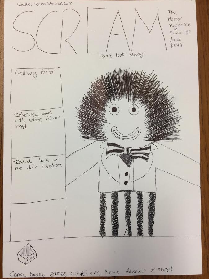
 We looked at magazines from Scream and Empire and looked at their common conventions and themes so we could replicate something to a similar standard. We began by drawing up an initial draft of how we might create the magazine if we were to feature on Scream. We made the golliwog the image and made it nice and big so it would be eye catching. We used the boxes on the side to showcase what else features inside the magazine. Along the bottom are other articles that feature inside the magazine including games, comics, news and competitions. These need to also stand out as they are key parts of the magazine.
The colour scheme for the magazine is likely to be red. This is due to the Golliwog's red jacket so the magazine should complement the colours. On top of this, red connotes blood which suggest horror and death. We will have blood dripping from the title and the border to the boxes will be blood splatters. This links to our production as we have gone for a short film based around an evil doll. We will use red for the masthead and all the headings on the page. This helps them all to stand out and be vibrant, which will help attract the audiences attention. The titles need to be eye catching because these are what the potential customers need to see to become interested in the magazine.
As this is a 'Scream' magazine, we will use the font they use for every masthead on all their magazines. To do this we will have to photoshop the masthead from a magazine, remove the background and then change the colour to math the colours on our 'Scream' magazine. This will make sure that the masthead we use is in theme with the rest of their range of magazines. It is important for a business such as Scream to maintain the same brand image across all their magazines as the masthead is the first thing the audience will see when looking for the magazine on a shelf with hundreds of other.
No comments:
Post a Comment